Slides from Markdown
npm install @react-markdown-kit/slides
import Markdown, { defineMarkdownPreset } from '@react-markdown-kit/renderer'
import { slides } from '@react-markdown-kit/slides'
import '@react-markdown-kit/slides/styles.css' // optional: scaling, class hooks, present mode

const preset = defineMarkdownPreset({ extensions: [slides()] })

<div className="rmk-document">
  <Markdown preset={preset}>{deck}</Markdown>
</div>
Try it in the slides demo: the editor on the left, the deck on the right, Present in the control bar.
A deck is Markdown
A deck is a CommonMark or GFM file whose slides are separated by ---
between blank lines. Nothing else is required. GitHub, a diff and an editor
that does not know the plugin all show the same file as a document with
rules. slides() is the package's whole API: it reads the parsed tree a
second way, and the renderer draws one <article data-rmk-deck> of
<section>s. Headings, lists, a GFM table and code inside a slide are the
same elements they are outside one, drawn by the renderer's own handlers.
--- front matter at the top of the file sets deck properties, read as
flat key: value lines with no YAML parser:
| Key | Value | Effect |
|---|---|---|
title | text | data-rmk-deck-title; the fallback is the first slide's title |
aspect | 16:9 (default) or 4:3 | data-rmk-deck-aspect, overriding the aspect option |
class | class tokens | Prepended to every slide's data-rmk-slide-class |
background | a URL | The background of every slide that sets none |
A --- inside a fenced code block, a block quote or a list item is not at
the root and never splits. *** and ___ are rules inside a slide, drawn as
<hr>. Front matter is found in the source rather than by the parser, so a
deck that opens with --- followed by content is plain CommonMark: a
leading break that opens no slide, and the lists and quotes after it keep
their shape. The reference for every construct is DIALECT.md, shipped
with the package.
Directives
A comment alone on its lines, anywhere in a slide, sets that slide's properties. One comment holds one directive.
| Directive | Argument | Emitted as |
|---|---|---|
<!-- class: … --> | tokens of [A-Za-z0-9_-], separated by spaces or commas; may repeat and accumulates | data-rmk-slide-class="a b", never class |
<!-- background: … --> | one URL | <img data-rmk-slide-background src alt=""> as the section's first child, so the renderer's URL policy sanitises it like any image |
<!-- name: … --> | [A-Za-z0-9_-]+ | id="slide-<name>" and data-rmk-slide-name, so #slide-numbers deep-links to it |
<!-- class: center, middle -->

# A centred title

Text and blocks centred on both axes.

---

<!-- class: inverse -->
<!-- name: numbers -->

## Inverse, and named

This slide is `#slide-numbers`.

---

<!-- background: /img/social-card.svg -->
<!-- class: inverse, bottom -->

## A background image
A centred title
Text and blocks centred on both axes.
Inverse, and named
This slide is #slide-numbers.
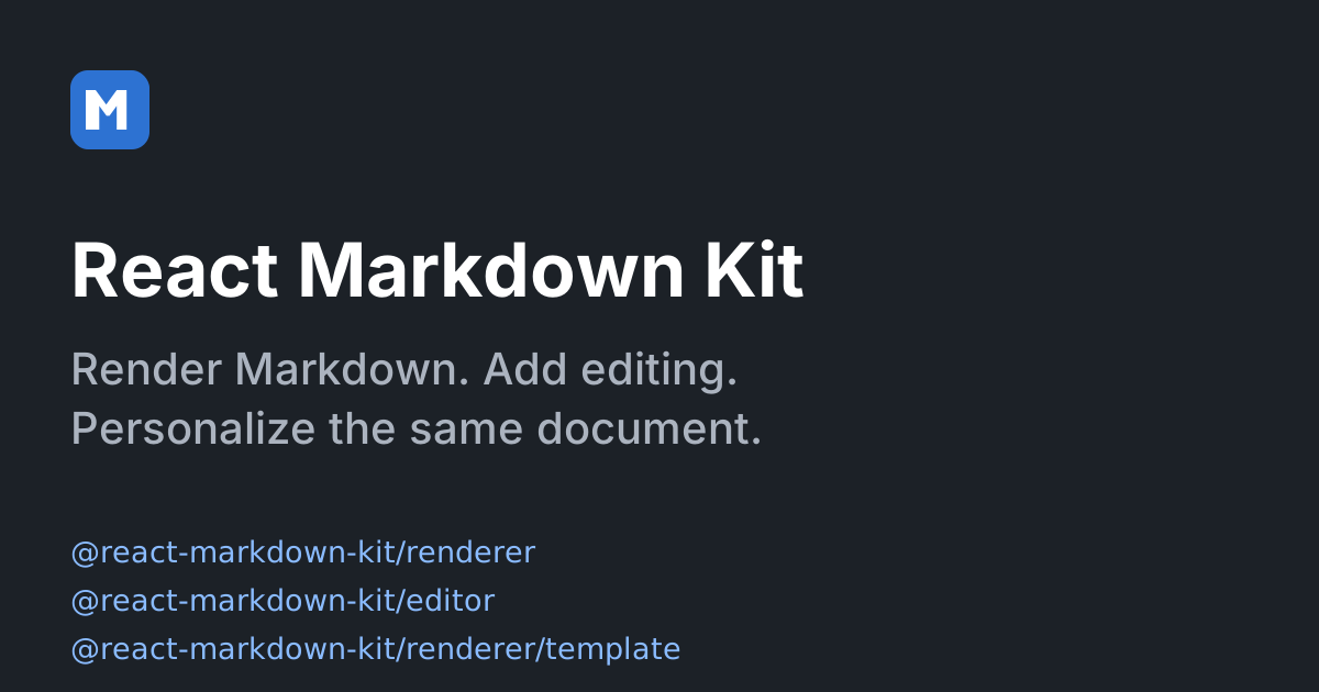
A background image
The stylesheet knows seven class tokens: left, center, right for text alignment,
top, middle, bottom for vertical placement, and inverse for the dark surface.
Any other token lands in data-rmk-slide-class for your own CSS.
A known key with an argument it does not accept, or an unknown key, leaves the comment as it is and reports a diagnostic. The comment renders the way any comment renders in the kit, as visible escaped text, so a typo is seen rather than silently dropped.
Speaker notes and fragments
A paragraph that is exactly ??? starts the speaker notes: every block
after it, up to the next slide break, is notes. A paragraph that is exactly
-- is a pause: the blocks after the k-th pause form fragment group k,
revealed one keypress at a time in present mode.
A ??? written on the line right after a paragraph, with no blank line
between, is lazy continuation of that paragraph in CommonMark; the plugin
reports SLIDES_MARKER_ATTACHED rather than guessing. A -- in the same
place is different: two or more dashes right under a line of text make that
line a setext heading, so the text becomes an <h2> and the plugin reports
SLIDES_SETEXT_HEADING. A blank line before the marker fixes both.
Present mode
@react-markdown-kit/slides/present is the same extension, under the same
name, with one renderer component: the article the static deck emits
becomes an interactive deck. The first render is the static markup, and the
controls mount in an effect, so server rendering and hydration see the same
DOM.
'use client'

import { slides } from '@react-markdown-kit/slides/present'

const preset = defineMarkdownPreset({ extensions: [slides({ hashRouting: true })] })
- Keys, listened for on the deck element and only while presenting, so a
deck in the page never captures the page's keystrokes: Right, Down, Page
Down, Space and
jgo to the next fragment, then the next slide; Left, Up, Page Up, Shift+Space andkgo back; Home and End jump;ftoggles full screen where the browser supports it;ptoggles the presenter view; Escape exits. Keys with a modifier, or typed into an input, are ignored. - Presenter view shows the current slide, a preview of the next one, the
notes with
hiddenlifted, and a clock. Open the deck in a second window withsync: 'my-deck'and both windows follow the sameBroadcastChannel, which is how the notes go on the laptop and the slides on the projector. - Deep links with
hashRouting: true:#3,#nameand#slide-nameopen present mode at that slide on load, and the hash follows the current slide while presenting. This page leaves it off, because the docs site owns its hashes. - Options:
initialMode: 'present'or'presenter'opens in that mode;controls: falseremoves the bar;labelsreplaces every string (SLIDES_LABELShas the defaults);onSlideChange(index)reports the zero-based slide.
There is no standalone slideshow component. The deck is reached through
<Markdown> and a preset, like every other feature of the kit, so the same
Markdown file renders as a document, a deck or a presentation depending on
the preset it meets.
Scaling, print and styling
The optional stylesheet scales without a script. Each <section> is a size
container with a fixed aspect ratio, and the slide body sets its font size
in cqw: 1.72cqw is 22px on a 1280px-wide slide, and the renderer's
em-based headings, lists and code follow. A browser without container units
gets a fixed size. The examples on this page raise that token in the stack so
half-width thumbnails stay readable; present mode uses the default.
| Token | Default |
|---|---|
--rmk-slide-surface / --rmk-slide-text | #fff / #1e1e1e |
--rmk-slide-inverse-surface / --rmk-slide-inverse-text | #1e1e1e / #fff |
--rmk-slide-font-size | 1.72cqw |
--rmk-slide-padding | 3.75cqw |
--rmk-slide-radius / --rmk-slide-shadow / --rmk-slide-gap | var(--rmk-radius) / none / var(--rmk-space) |
--rmk-deck-backdrop / --rmk-deck-chrome / --rmk-deck-chrome-text | #111 / #222 / #fff, present mode |
The classNames prop of <Markdown> gains three parts, deck, slide and
slideNotes, for a utility-class setup. Everything else is a data attribute
on a plain element, so a stylesheet of your own needs no class from the kit.
Printing gives every section break-after: page and hides the controls. The
page size is yours to set:
@media print {
  @page { size: 16in 9in; margin: 0; }
}
Diagnostics
Content problems never throw. Each is a diagnostic on the compiled document
with the node's source range, and every code is exported as
SLIDES_DIAGNOSTIC_CODES.
| Code | Severity | When |
|---|---|---|
SLIDES_SETEXT_HEADING | info | A depth-2 heading made by dashes right under text; a blank line before --- makes it a break |
SLIDES_SLIDE_EMPTY | info | A slide with no content blocks; still rendered, because an author who just typed the break must see it |
SLIDES_FRONT_MATTER_INVALID | warning | --- then key: value lines at the top with no closing --- line, or a line that is neither blank nor key: value before it |
SLIDES_DIRECTIVE_INVALID | warning | A known directive or front matter key with a rejected value |
SLIDES_DIRECTIVE_UNKNOWN | warning | <!-- key: value --> with a key that is not a directive |
SLIDES_NAME_DUPLICATE | warning | Two slides with the same name; the later one gets no id |
SLIDES_MARKER_MISPLACED | warning | A second ???, or a -- after ???; ignored |
SLIDES_MARKER_ATTACHED | warning | A -- or ??? glued to the paragraph above |
SLIDES_PROPERTY_BARE | info | A slide opening with bare key: value lines, remark's syntax, which this dialect does not read |
What the renderer emits
<article data-rmk-deck="" data-rmk-deck-slides="3" data-rmk-deck-aspect="16:9" data-rmk-deck-title="Q3 review">
  <section data-rmk-slide="2" data-rmk-slide-title="Numbers" aria-roledescription="slide" aria-label="Numbers"
           id="slide-numbers" data-rmk-slide-name="numbers" data-rmk-slide-class="center middle" data-rmk-slide-fragments="1">
    <img data-rmk-slide-background="" src="https://example.com/bg.jpg" alt="">
    <div data-rmk-slide-body="">
      <h2>Numbers</h2>
      <p>Revenue is up.</p>
      <div data-rmk-fragment="1"><p>So are costs.</p></div>
    </div>
    <aside data-rmk-slide-notes="" hidden=""><p>Pause before the second line.</p></aside>
  </section>
</article>
- No script, no class, no inline style, no id other than
slide-<name>. Optional attributes appear only when set. - Server-renderable. The deck is built as hast by a handler for the mdast
root, so it works in a server component and in static rendering. The decks on this page were rendered when the site was built. - Accessible by default. Each section carries
aria-roledescription="slide"and anaria-labelfrom its first heading, withslideLabeland the slide number (Slide 3) as the fallback. - The rest of the document is untouched. GFM footnotes land after the
article, and the content policy runs on the deck the way it runs on any
output, which is why a
javascript:background loses itssrc.
Editor
@react-markdown-kit/slides/editor adds the authoring half: the present
entry plus an editor capability, under the same name, so it replaces the
renderer's slides() in a preset.
import { MarkdownEditor } from '@react-markdown-kit/editor'
import { slides } from '@react-markdown-kit/slides/editor'

const preset = defineMarkdownPreset({ extensions: [gfm(), slides()] })

<MarkdownEditor preset={preset} value={value} onChange={setValue} />
- The toolbar gains four buttons in a
slidesgroup: New slide, Speaker notes, Pause and Background. The first three insert---,???and--; Background inserts a directive chip whose value is typed into an inline field. - Typing
---,***,--or???on a line of its own and pressing Enter turns the paragraph into the matching node. - A
<!-- key: value -->directive is a chip. Clicking its value edits it in place; Enter commits, Escape cancels, and a value the directive rejects is marked invalid and never written. - Preview mode renders through the renderer, so it shows the interactive
deck, Present button included. The deck stylesheet is scoped to
.rmk-document; the example above gives the preview surface that class withclassNames={{ preview: 'rmk-preview rmk-document' }}. - Every untouched block is written back from its original bytes. A deck loaded and saved without edits is unchanged.
- Front matter stays an opaque block in rich mode; edit it in source mode.
- Labels: the editor's
labelsprop relabels the toolbar buttons by id (slide,slideNotes,slidePause,slideBackground) and the node captions underslides.notes,slides.pause,slides.slideBreakandslides.rule.slides({ editorLabels })sets only the node strings per preset (notes,pause,slideBreak,rule,directive(key),directiveValue); it cannot rename a toolbar button, so button captions always go throughlabels.
The built-in horizontal-rule button still inserts the editor's own rule node,
which is unlabelled until the document is next loaded. A deck editor hides it
through the toolbar render prop.
Templates
With @react-markdown-kit/template, a {{placeholder}} in slide prose
resolves like anywhere else. Markers and directives are literal: a
placeholder inside <!-- background: … --> is never data, so runtime values
cannot set a slide's properties. List slides() before template().
The three entries
| Entry | Loads | Adds |
|---|---|---|
@react-markdown-kit/slides | nothing beyond the parser | the extension: dialect, diagnostics, the static deck, serialization |
@react-markdown-kit/slides/present | React | a client article component: present mode, keyboard and pointer navigation, fragments, presenter view, deep links, cross-window sync |
@react-markdown-kit/slides/editor | React and Lexical | the present entry plus editor nodes, the Enter shortcut and the four toolbar commands |
All three return an extension named slides, so a later entry replaces an
earlier one in a preset. A Node service that renders decks to HTML, or
resolves templates in them, imports the root entry and installs neither
React nor Lexical.
Programmatic API
There is none beyond the plugin, on purpose. slides(options?) takes
aspect ('16:9' or '4:3'), notes, frontMatter and slideLabel;
/present adds hashRouting, initialMode, controls, sync, labels
and onSlideChange; /editor adds editorLabels, the node captions only
(toolbar buttons are relabelled through the editor's labels prop). The
node type constants,
the type guards and the diagnostic codes are exported for tooling that walks
a compiled document.